Brand assets and visual identity principles
Simple guidelines how to use the Skustack brand and its
downloadable assets for your convenience.
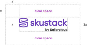
Clearspace
We wanted to visualize Skustack’s core identity in a clear way.
The S letter shape is interwoven into a stack of warehouse cargo which visually gives out the concept of the business.

Usage
Our logo needs to be clearly visible at all times.
Colors
RGB – 103/58/183
HEX – #673AB7
CMYK – 80/90/0/0
RGB – 171/71/188
HEX – #AB47BC
CMYK – 50/90/0/0
RGB – 51/51/51
HEX – #333333
CMYK – 20/20/20/80
RGB – 102/102/102
HEX – #666666
CMYK – 20/20/20/60
Font
It’s classy, modern, and approachable. Just like us.
We use Montserrat for headlines and details
Easygoing and friendly — the Skustack typeface is expressing our willingness to helpfully drive your business forward.
A B C D E F G H I J K L M N O P Q R S T U V W X Y Z
a b c d e f g h i j k l m n o p q r s t u v w x y z
0 1 2 3 4 5 6 7 8 9 ? ! % &
A B C D E F G H I J K L M N O P Q R S T U V W X Y Z
a b c d e f g h i j k l m n o p q r s t u v w x y z
0 1 2 3 4 5 6 7 8 9 ? ! % &


